
Screenshots of the chart dialog
Total return comparisonThe first chart compares the total return from GE investment with the Cisco investment for the period of the last 200 days. |

|
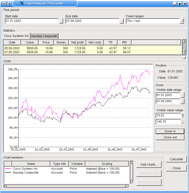
Benchmark comparisonThis chart compares the price performance of the Cisco shares with a benchmark, here the Nasdaq Composite. Both quotes are indexed with a common base value of 100. The period covered here is the current year. So you can quickly see, that Cisco outperformed the index this year. |
|
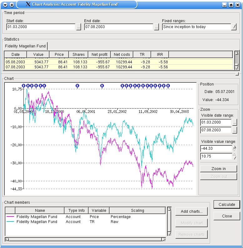
Cost Average EffectThis one is very nifty. It shows on one hand the total return of the investment, on the other hand (or chart) you see the percentual price development. With one time investments and no additional influences like fees or dividends, both lines should overlap. But if you invest, like here, more than one time (do you see the small blue B balloons?), you can nicely see the cost average effect here. |
|
Cumulated ChartsThe last one shows four line charts. Three are value charts and show the value development of all funds (in our example only one), all stocks (we have two here) and both. Additionally to see also the influence of additional investments on the value development, there is also a chart, which shows the invested money. Every time, when the line goes up, you should see a corresponding blue balloon at the top of the chart window. |

|
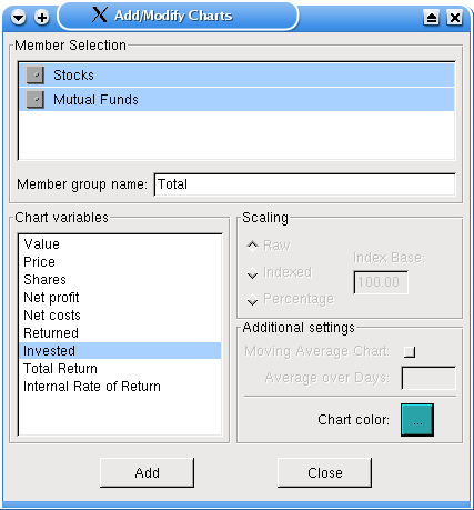
Chart ConfigurationFinally, this screenshot shows, how you can configure the charts. In this case, you see the configuration of the invested chart from the last screenshot. In the member selection area you can select members, which values should be displayed. If you select more than one, the correct calculations are automatically done (only a price chart makes no sense anymore). In this case, you should give a declarative name for this member group, here Total. On the left side, you select the kind of chart you want to display. You can access a glossary from the main window, where the meaning of each entry is displayed.Additionally to see also the influence of additional investments on the value development, there is also a chart, which shows the invested money. Every time, when the line goes up, you should see a corresponding blue balloon at the top of the chart window. On the right side, there are scaling settings which can be done for price charts. This was used for the second and third screenshot. Additional settings are not supported yet.Finally you choose a line color for your chart. |
|